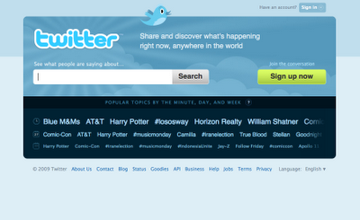
Twitter just rolled out its redesigned front page for those visitors new to Twitter.com. If you’re already a registered user, you won’t notice the new look unless you sign out and refresh the home page.
The new homepage helps provide a frame of reference, expectation setting, and also offers a lens into the conversations populating the popular microcommunity that connects people through 140 character strings.
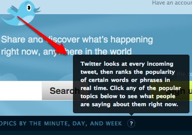
Twitter now places an emphasis on search, the very functionality that helped Twitter earn prominence among a core, passionate, and extreme group of digital extroverts. The intention is to introduce new visitors to conversations that are related to the keywords that are important to them. As the site homepage now reads, “Share and discover what’s happening right now, anywhere in the world.”
The landing page now also provides insight into the popular topics by minute, day, and week.

This move, while in the works for quite some time, follows the release of the Twitter 101 guide designed to help businesses embrace and leverage the power of Twitter and the Tweets that fuel the new media revolution.
Perhaps this is exactly what Twitter needs to start doing more of in order to keep users Tweeting(tm)!
For those looking to get insight into the real-time conversations powering the entire social Web, try Collecta.
Connect with Brian Solis on:
Twitter, FriendFeed, LinkedIn, Tumblr, Plaxo, Plurk, Identi.ca, BackType, Posterous, or Facebook
—
Kindle users, subscribe to PR 2.0 here.
—
Now available (click to purchase):
—
pr pr+2.0 pr2.0 public+relations marketing advertising interactive social+media socialmedia brian+solis social media media2.0 media+2.0 2.0 smo social+media+optimization marcom communication publicity advertising interactive spin brand branding Tweet twitter sponsored conversation


The new Twitter homepage looks great. It is much more user friendly than it was before. I'm not sure if it will make a noticeable difference in whether people will join the site or not. At least they will be able to see the current trending topics as well as search for a topic of interest.
Nice blog. Just connected with you on Twitter although we're already linked up via Facebook. And I love your Flickr feed – aren't you lucky getting to take photos with beautiful women all day. LOL!
Would love to talk some time.
Best,
Shawna
“Digital extrovert” really jumped out at me. Does that imply that those people are not typically extroverted IRL? Would that make them “shy”?
Oh, and nice post, it's about time Twitter took some ownership of supporting and growing their userbase by demonstrating how to use a new tool.
Thanks Marc. I was hoping that “digital extrovert” would strike the curiosity of someone! It's not based on scientific fact, just personal observations…I believe that twitter and social media in general is uniting IRL introverts and extroverts into a digital community rich with voyeuristic, observational, and participatory cultures whose behavior is still evolving and refining. At the very least, I believe that the social web invites and empowers those to say what they feel and think online, which is some cases represents the words that they might not have otherwise shared in real life.
Well, that leads to whole other conversations, such as designing environments that enable and promote this type of behavior and relationship building that is different from how people interact IRL. Which requires study and strong integration with UX/UI design. And I see you quietly referencing the 90-10-1 rule of thumb (Slide 9 from Charlene Li's presentation http://www.slideshare.net/charleneli/brandworks…).
Excellent points Marc!
Re: Charlene, I do admire her work. Forrester spent a lot of time and
resources analyzing the data behind technographics. I'm measuring my work
based on individual fieldstudies and also the information that stems from
Harvard rersearch (published). I think we all say the same things…
NBA Jerseys
Atlanta Hawks jerseys
THANK GOD. The graphic designer in me has grumbled every single time I have been forced to login there for a LONG LONG time.
P.S. YOUR new site design is very nice as well.
THANK GOD. The graphic designer in me has grumbled every single time I have been forced to login there for a LONG LONG time.
P.S. YOUR new site design is very nice as well.
Most of the British news broadcaster or Media come out in favour of David Cameron,
but when you ask the college or university student, they can all see straight through the deceit or lie of David Cameron and they either come out in favour of Gordon Brown or Nick Clegg I would put Nick Clegg in first place and Gordon Brown second, David Cameron have no respect for poor people, so do not be deceit by David Cameron, David Cameron only support the rich and greedy people and not the poor and needy or deprived people.
The new twitter home page looks great. It is more easier to navigate than the previous twitter home page.