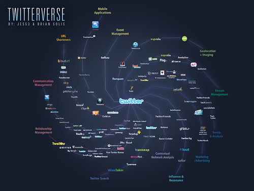
Twitter connects people through a rich and active exchange of ideas, thoughts, observations, and interests in one, highly collaborative and promising ecosystem. The Twitterverse advances micro interaction and connections through an expanding network of applications, engendering the potential for macro reach and resonance online and IRL (in real life).
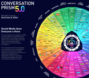
Following the recent debut of The Conversation Prism v2.0, Jesse Thomas (@jess3) and I proudly introduce an alpha version of The Twitterverse. While the landscape for Twitter approaches 1,000 different applications, this map visually charts the important tools to help communications, service, marketing, and community professionals more effectively navigate, engage, analyze and measure participation on Twitter.
Please share suggestions, additions, or changes in the Flickr comments section. We’ll integrate the feedback into the next rev of the Twitterverse and release formally as a poster and a downloadable high-res graphic.
Connect with me on:
Twitter, LinkedIn or Facebook
—
Now available:


Revolutionary… once again.
That’s really impressive. Love the layout and design. Maybe I missed them but I didn’t see Twitpic and Topify up there.
Great visualization, Brian and Jesse! One question that you may want to elucidate (if it matters): does it matter where on the “spoke” the app is located? I mean, does it make a difference if something is closer to the Twitter center, or out on the edge? Also, icons are different sizes? Does that signify size of install base? typically that’s what it means on a perceptual map.
Awesome post Brian! Extremely helpful indeed.
We should hangout again sometime. Look forward to good times to come!
This looks fantastic. Is Gravity (phone app) worthy of a mention?
You missed the Mac and Windows desktop clients (and the occasional cross-platforms, though most Mac users shun them).
And Twitterrific isn’t on there? Really? You should look at Tweetstats’ client summary.
Poster? I’ll take the poster, the t-shirt, the coffee mug, the wallpaper and, perhaps, the tatt. Great work!
Nice post!, But you forgot http://www.livemapped.com
Would like to see http://localtweeps.com on the map. Thanks!
Beautiful, like a spiraling galaxy.
My only question is that you say you include that are relevant to "professionals" and I wonder why & how you make that distinction between just regular users. Is it the occupation of the user or how they use Twitter that counts? That's even if people use it just one way.
Very interesting!
Splendid effort!
Suggestions for additions from my end would be:
Existing Categories:
– Mobile: Twitterific, UberTwitter
– Trends & Analysis: Favrd
New Categories:
– Twitter Clients: TweetDeck, Seesmic Desktop, etc.
– Photo-Sharing: TwitPic, YFrog, TweetPhoto, MobyPicture
– Video-Sharing: TwitVid.io
Visually appealing and from a directory standpoint a nice way to classify the apps. What I personally think would be interesting is to see you guys map apps that can be used together to accomplish various use cases…well just the most common ones.
Thanks for sharing!
@robblewis
Marie took the words out of my mouth.
Nice job though!
Superb work, an excellent, lucid discussion(s). Your blog is current, relevant and definately bookremarkable! Thanks to you and those commenting.
@rickshatto
Brian,
Great effort, and after some initial rounds of feedback mostly through the comments section and long thread at Flickr http://tr.im/mYWE (where I have my main stream of feedback as well in different rounds), I summarize main drawback categories bulleted here;
– Lack of transparency regards research methodology (now the selection criteria seems arbitrary, especially with apps and services like TweetDeck and TwitPic excluded)
– Thus, give selection criteria
– Meaning of connections in between the apps
– Meaning (if there is) of logo proximity to the center and size
– Lack of category Twitter Client (that is very widespread as a term used to categorize those apps that manage multiple, if not any, of the other tasks on the arms)
Those are the main points, but I have a lengthier and deeper feedback in turns on http://tr.im/mYWE.
I welcome your feedback beyond next conference (that you obviously attend).
And I am also looking forward for the next poster “The Social Marketing Compass”. I also feel that a visualization of this kind for the Conversation Index would be great, to gather methods and tools to simplify trace of convos in the Social Web and through the reflection done in the Conversation Prism.
Colorful is the word!
Thanks for your continuous efforts and great graphics, with abstractions well done and a synthetic/analytic groundwork to get collaborative and collective wisdom regards the social web leveraged!
In dialogue, keep it up!
Peace,
Anders
Sustainopreneurship Facilitator @sliceonline
Few more suggestions for Twitter apps that are missing from this pic:
– ceTwit – http://www.kosertech.com/blog/?page_id=5 (mobile app)
– Spaz – http://funkatron.com/spaz (AIR app)
– Tweetvisor – http://tweetvisor.com (web-based app)
Brain,
Thought your Twitterverse was great. I wrote a response piece that builds on your idea called, “Powers of Ten’ for the Twitterverse. It’s posted as psfk. http://adjix.com/ejkt Hope all’s well. Simon
Well , the view of the passage is totally correct ,your details is really reasonable and you guy give us valuable informative post, I totally agree the standpoint of upstairs. I often surfing on this forum when I m free and I find there are so much good information we can learn in this forum!
multi-cavity
I love this post – great picture of the Twitterverse